Role: UX/UI Designer (Team of 3)
Tools: Sketch, InVision and Principle
Duration: 3 Months (2018)
Tools: Sketch, InVision and Principle
Duration: 3 Months (2018)
Overview
About Grocery Gateway: Grocery Gateway is an online grocery delivery service acquired by Longo’s. And have been the leader of online grocery delivery in the Greater Toronto Area and across Ontario.
The Challenge: The business wanted to increase the exposure to new products, improve their sales and customer loyalty on their mobile application. My team and I used this opportunity to propose improvements on their ‘My Lists’ page that allows users to create grocery lists.
The Solution: With the data collected from user interviews and affinity mapping, we strategized a solution and concluded with a product feature that will allow customers to edit and remove items on their list.
Process
1. Understand: Business objective, User research, Mapping, Define problem
2. Design & Solution: User journey, Wireframing
3. Validation: User testing, Prototyping
4. Takeaways: Conclusion, Feedback, Reflection
1. Understand
To gain a comprehensive understanding of user needs and behaviors, we conducted in-depth interviews with 10 target users. These participants, representing our core demographic, were asked to perform key tasks within the application, including: placing an order, creating a curated list for special occasions, navigating product categories, and responding to 'Out of Stock' scenarios.
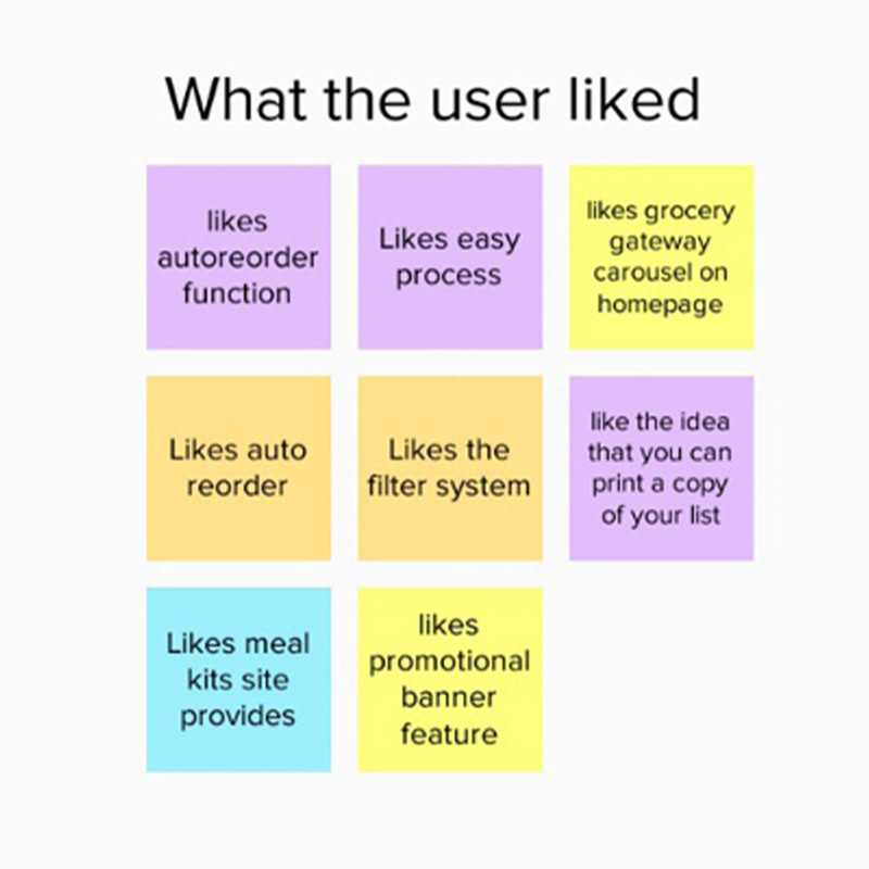
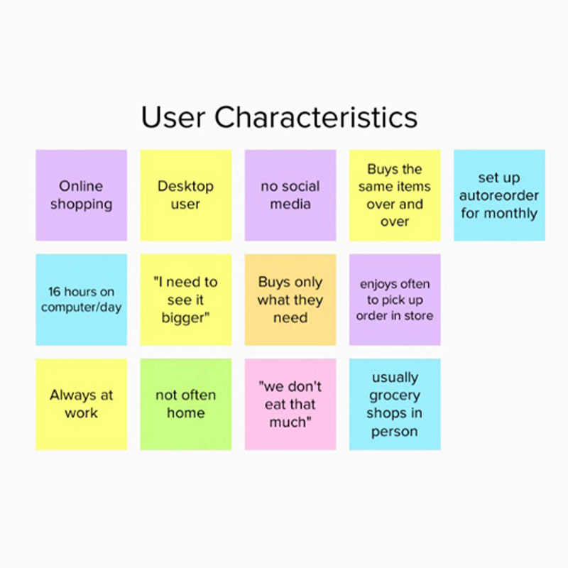
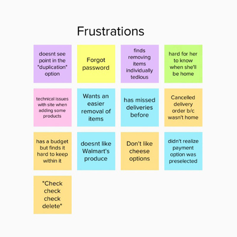
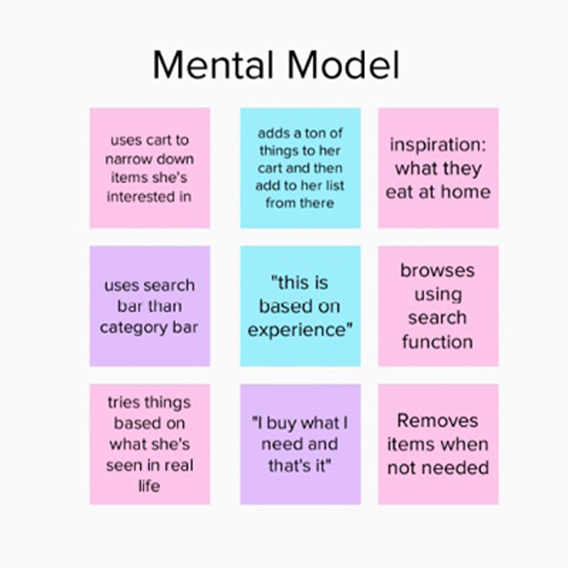
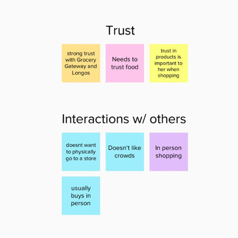
Through these interviews, we uncovered critical insights into users' information-seeking strategies, pain points, and overall experience. The data revealed key user frustrations, established trust factors, identified usability limitations, and clarified user goals. This deep understanding, fostered through empathetic analysis, enabled us to prioritize design solutions that directly addressed user needs.
We utilized affinity mapping to synthesize the interview data, identifying recurring themes and patterns. This process allowed us to pinpoint key areas for design focus and develop a user-centered strategy for improvement.
Key takeaways:
1. Users like to browse the homepage for promotions, deals and new items on the website.
2. Removing and editing items on the ‘My List’ page is frustrating.
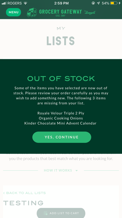
3. Items get out of stock quickly and there’s no recommendation in the user’s grocery lists.
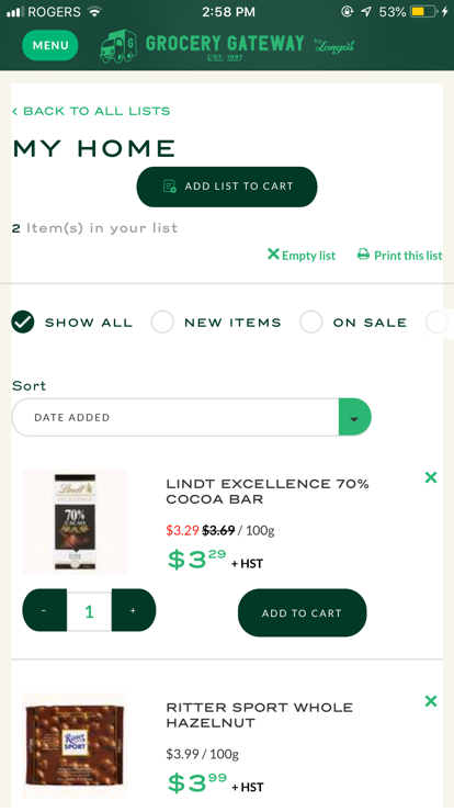
2. Design
Following the user research and problem definition phases, we moved into the design phase. We began by synthesizing the affinity clustered data to identify key design priorities and user-centered initiatives. These initiatives were:
1. Streamline 'My Lists' Onboarding: Transform the initial onboarding experience to be intuitive and engaging for new users, ensuring they quickly grasp the value and functionality of the 'My Lists' page.
2. Enhance 'Out of Stock' Item Handling: Redesign the presentation of 'Out of Stock' items, providing clear visibility of availability and offering relevant alternative product options to minimize user frustration.
3. Implement Efficient List Editing: Introduce a robust editing option on the list page, specifically enabling users to remove multiple items simultaneously, significantly improving list management efficiency.
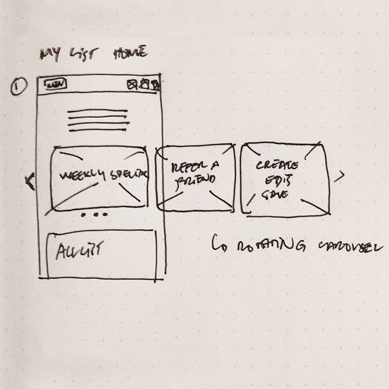
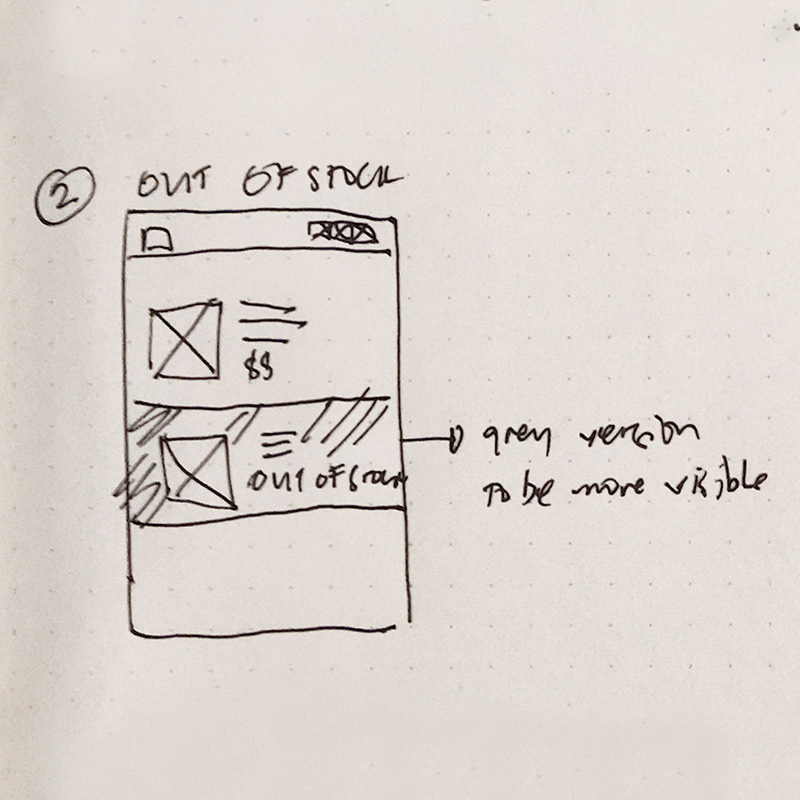
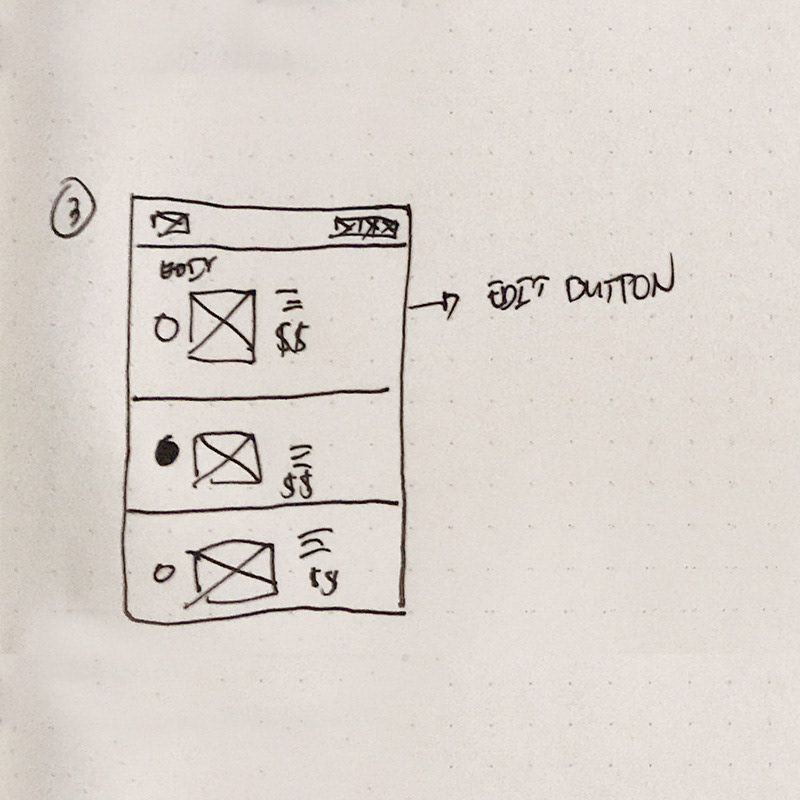
Our design strategy centered on achieving these core user goals:
1. Efficient Bulk Editing: Develop a user flow and prototype that empowers users to effortlessly remove multiple items from their lists, saving time and reducing frustration.
2. Seamless 'Out of Stock' Alternatives: Provide clear and relevant alternative product options when items are out of stock, ensuring a smooth and uninterrupted shopping experience.
3. Intuitive Onboarding: Design a simple and easy-to-understand onboarding experience for new users, ensuring they can quickly grasp the functionality and benefits of the 'My Lists' feature."
Low Fidelity Prototype
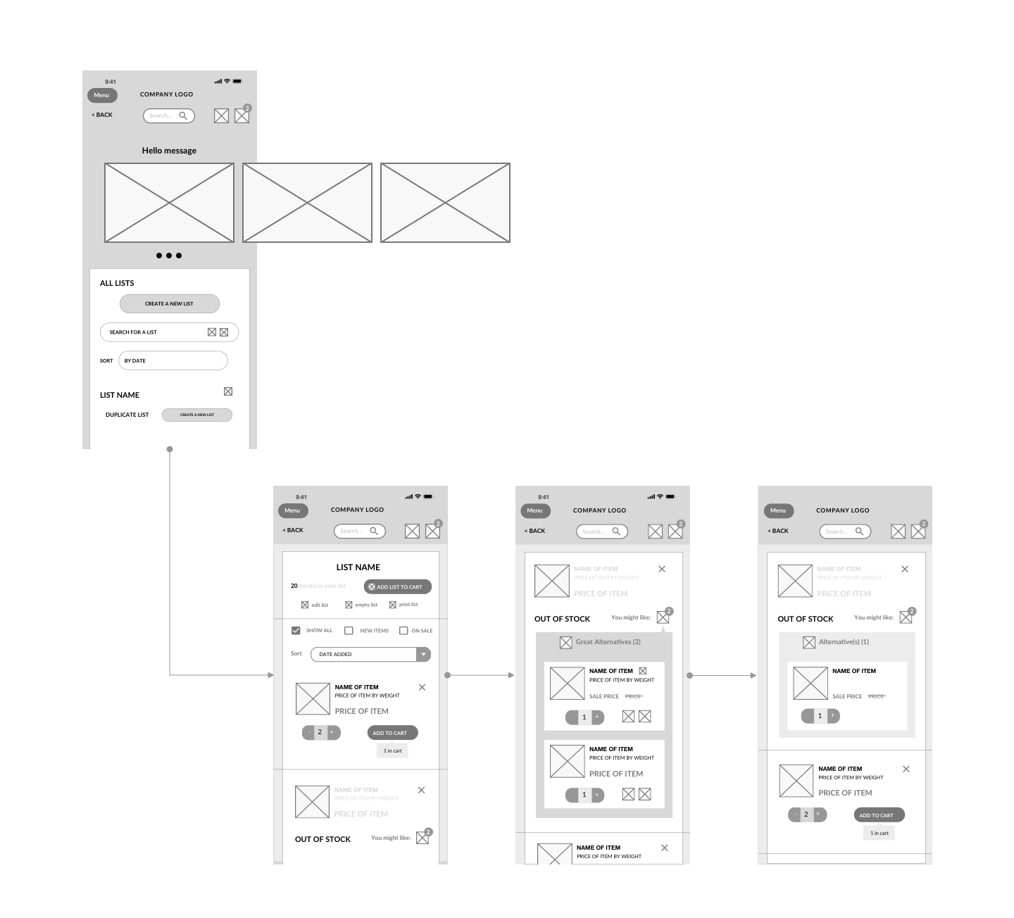

High Fidelity Prototype
3. Conclusion and Learnings
To validate our design solutions, we conducted usability testing and employed the same task scenarios used in the initial user interviews. Key findings included:
1. The implementation of a confirmation modal for item deletion significantly reduced user errors and increased confidence in list management.
2. The placement and size of the ‘edit’ and ‘delete’ buttons proved highly effective on smaller mobile screens.
We gained valuable insights into the importance of iterative testing and data-driven design. Had we possessed initial stakeholder data, we could have:
1. More precisely identified high-impact opportunity areas within the app.
2. Developed more targeted and effective interview questions, leading to richer user insights.
3. Planned a more efficient timeline that would have allowed for further testing iterations.
We also learned that future projects would benefit from a dedicated accessibility audit, and that we should create style guides that are more robust for smaller screen usage.