Role: UX/UI Designer
Tools: Figma
Duration: Personal project (2021)
Overview
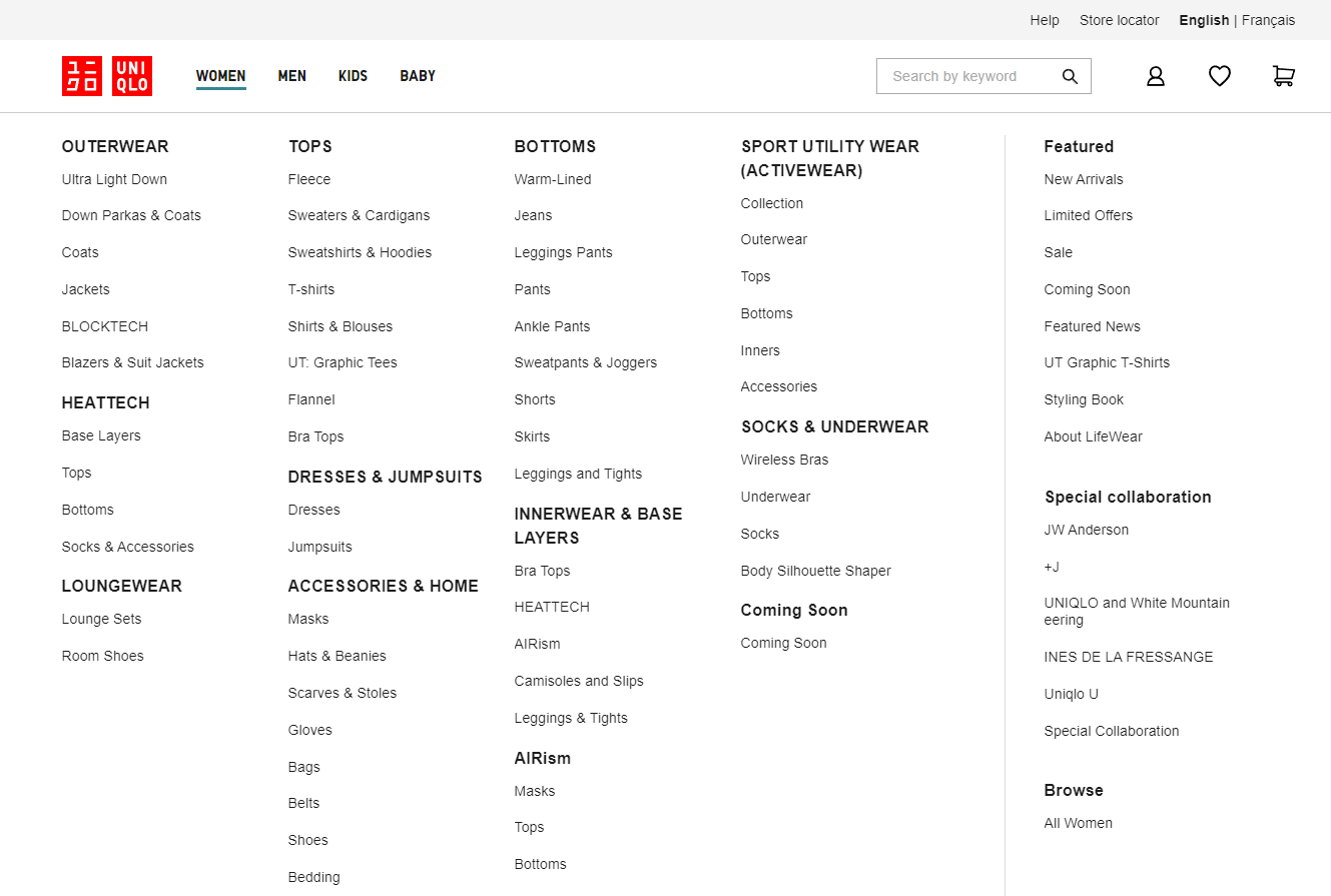
Uniqlo's Canadian website, while featuring a wide range of products, presented challenges for users due to information overload and a confusing navigation structure. This resulted in a difficult shopping experience, hindering users' ability to quickly find and purchase desired items.
To address these issues, I focused on improving the site's usability and overall shopping experience. My design solutions included a refined navigation system, an enhanced product page layout, and the introduction of new features designed to streamline the shopping journey. Through high-fidelity prototypes, I demonstrated how these changes would create a more intuitive and enjoyable experience for Uniqlo's customers.
Process: Understand
To gain a deep understanding of the user experience, I conducted a thorough analysis of the online purchase flow on Uniqlo's website. This involved meticulously mapping the user journey, identifying pain points, and gathering key insights to inform my design strategy.
Key Findings
Navigation Overload: The primary navigation presented an overwhelming amount of information, making it difficult for users to efficiently locate desired products.
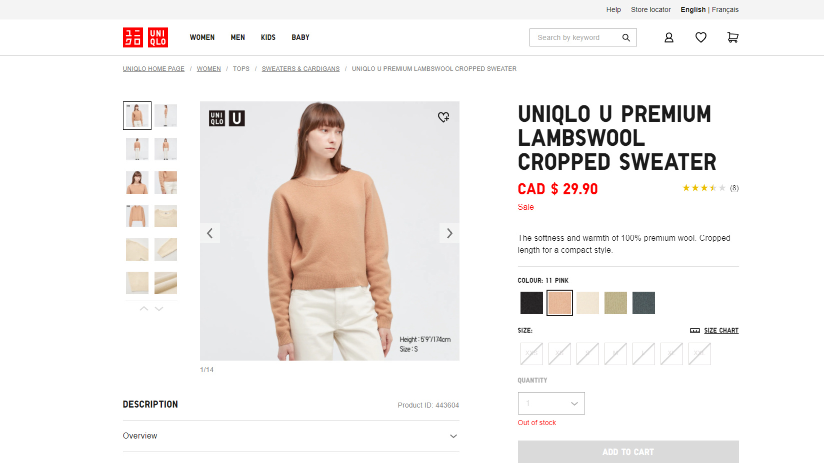
Product Page Clarity: The product page lacked a clear information hierarchy and consistent design architecture, resulting in a cluttered layout and hindering users' ability to focus on essential details.
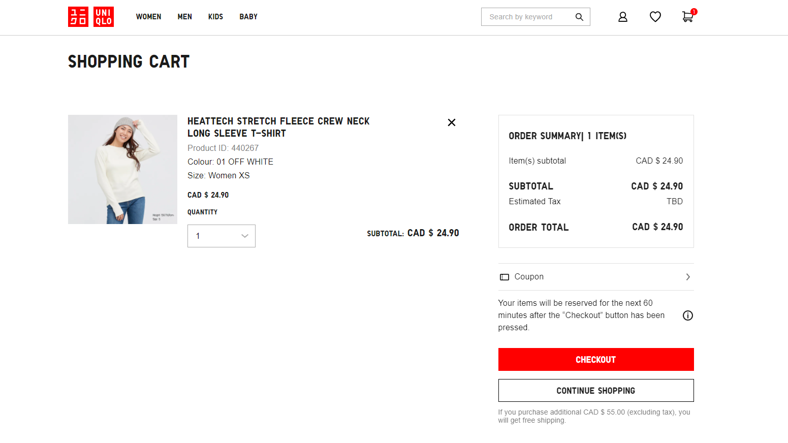
Cart Usability: The cart experience was cumbersome, with limited accessibility for viewing and editing items while simultaneously browsing the site."


Process: Design
Building upon the user insights gathered, I initiated a comprehensive competitive analysis, examining best practices in e-commerce design across both domestic and international markets. This included a detailed review of navigation structures, product page layouts, and cart functionalities implemented by leading apparel retailers.
Leveraging these insights, I developed a user-centered design strategy focused on addressing the identified pain points. This involved:
1. Streamlining Navigation: Implementing a refined navigation system that prioritized clear categorization and efficient product discovery.
2. Enhancing Product Page Clarity: Redesigning the product page with a clear information hierarchy and consistent visual architecture to improve focus and comprehension.
3. Optimizing Cart Usability: Introducing intuitive cart functionalities that facilitated seamless viewing and editing of items, without disrupting the browsing experience.
High Fidelity Prototype
Home Page
1. Optimized navigation system by removing sub-categories to create product discovery
2. Introduced dialog box in the home page carousel to reduce accessibility concern of text on image.
3. Added CTA button that links to featured products for seamless experience.
Product Page
1. Reimagined product page by improving information hierarchy and consistent visual architecture to improve focus and comprehension
2. Increase image size and switching to scrollable gallery
3. Improved product details and add to cart experience
Dialog Boxes
1. Improved global search allowing user to search without disrupting the browsing experience.
2. Introduce dialog box for log-in and view cart feature into dialog boxes for seamless viewing and editing of items.
Reflection and next phase
This redesign of Uniqlo's desktop experience provided valuable insights into optimizing e-commerce platforms for usability and user satisfaction. Key learnings included the importance of:
1. Clear navigation.
2. Focused product presentation.
3. Streamlined cart functionality.
Moving forward, I aim to expand upon these improvements by addressing the mobile experience and prioritizing accessibility enhancements, such as:
1. Improved screen reader compatibility.
2. Keyboard navigation.
Furthermore, I recognize significant opportunities to optimize the cart editing and checkout process, which currently present unnecessary friction for users. Specifically, I would focus on:
1. Reducing the number of steps required.
2. Providing clearer feedback during the process.
To further streamline the shopping experience, I propose implementing a 'Continue as Guest' checkout option for existing customers, enabling a more efficient and seamless transaction.